Wednesday 28 December 2011

Context of Practice - Lecture 7 - High Culture / Low Culture

Definition of Avant-garde - Idea of doing art/ design work that is progressive/ innovating
                                             - also it refers to the idea of there being a group of people being innovative

  • Art as avant garde is a class attack on critics and the rules of the art at the time
  • today art culture is to experiment for experiments sake
  • As today there is almost a pressure to constantly be progressive and innovative 
  • As avant-gardism grows, the main qualities that are aimed for by artists is to shock and be radical which becomes somewhat of a drug for artists
  • This leads to experiment for experiments sake and therefore concept takes place over aesthetics.
  • This then becomes the priority of the artists - striding to be original and in no way copy any other.
  • Artists begin to announce that creativity comes from within them and it must be let out
  • Throughout history art has never been about being creative, from the 16th to 18th century only high class people could go to art school, where they were taught to duplicate the work of great artists until they could replicate it perfectly, they were not allowed to create their own work, however, this was not creativity or avant gardism
  • At that time art could only be purchased by the church or members of aristocracy so the market for art was not very large, therefore art was never about being creative, it was about the work of a master.
 
  • 'Fauves' - the work of painters who are self taught - created new styles of art which was very experimental and was seen as an attack of the established art world.
  • Class shifts have allowed art to be more available but it is still restricted due to the demand of art  types and the fact artists see them selves as above all others.
  • Art then starts to seem self destructive
  • Artists then see themselves as separated from "all the rest" of the population as they believe they are special
  • They believe they are beyond their work and blame the public for not understanding their work
  • The public are then viewed as 'stupid' by the artists for not understanding their work 
  • Fine art becomes misunderstood
  • Critics help fine art by creating theories that have no meaning, their job was to write about why certain art was good, they made a career out of explaining difficult to understand art
  • They also protect the art world by constantly creating arguments
  • Critics ensure they protect their own interests by suppressing all other art cultures.
  • For example, American critics say any other countries work is pointless.
  • Art movements are often directed by powerful figures such as Stalin 
 Opposing term Kitsch  -

Kitsch - Art, objects, or design considered to be in poor taste because of excessive garishness or sentimentality, but sometimes appreciated in an ironic or knowing way

Kitsch is basically the opposite of avant garde, but I am not sure if that means everything that is not avant garde is Kitsch?

Saturday 10 December 2011

Lecture 6 - Film Theory Lecture 3 - Italian Vernacular Cinema

Definition

Vernacular - Available to everyone

  • Fellini is taken seriously as an auteur
  • Films are very stylish and sophisticated
  • His films contain interior meaning, seen as worthy of critical appraisal
  • La Dolce Vita (1960) - by Fellini, was epitome of style and sophistication, this film made sunglasses fashionabl.
Prima Visione and Seconda Visione
  • These cinema's attracted more middle class sophisticated audience, these were more like the cinema we have today.
Terza Visione -
  • Audience in 1970's determined direction of the films and were mostly working class Italian families
  • People went to the cinema every night, so many films are needed to play, In many cases cinema used to be used mostly as social background noise.  While people go there to socialise, talk, drink, eat.
  • People often entered the cinema at any point in the film
  • Wagstaff said, that terza visione is  more like a television audience, who go to the cinema after their dinner, with no particular film in mind, using it often as a social event, similar way to mass in some churches.

  • Filone  - has a similar meaning to genre but it is based on the idea of geology - layers of veins within a larger layer
Examples of Filone
  • "Giallo" - based on detective novels
  • Spaghetti Westerns
  • Mondo - Cannibal Films
  • "The Good, the Bad and the Ugly" is an example of Filone
  • Use of sound and music to create tension, lack of dialogue, use of eye line and cutting  to create a personal connection with the audience.
  • Differences in scale, Use of Camera to tell a story, Fragmentation of body and Catholic references.
Giallo
  • italian for 'Yellow'
  • Stem's from cheap paper back crime and mystery novels with trademark yellow covers
  • Made for mass audiences, gore and grime, some Giallo films are artistic, some are grind house and cheaply made
  • Gross out movies
  • These films challenge our senses and standards of 'good taste' at their worst
  • Mario Bava is famous as a 'Giallo' Director
List of Giallo Directors and their films


  • Often the protagonists that feature are American of British tourists visiting Italy.
  • They most commonly worked in the creative industries
  • This portraits a more cosmopolitan 'Jet set' life style to glamorise the life of the audience
  • A study was carried out on 'Giallo' films by Mikel J Loven and he discovered that the killer always was covered, wearing gloves, hat and overcoat, this was done purposefully to keep the gender and identity a total mystery.
  • Priests were often used as a gender confusing element to the killers identity
  •  Dario Argento was known as the Italian Hitchcock
  • Like Hitchcock he also places himself in the film - usually as the killers black gloved hands
  • 'Visually stunning 'set pieces''
  • Films were shot without sound so they could be dubbed in many different languages
  • He would ensure the solving piece was some form of art, this was purposeful as to hint to the audience that art and a jet set lifestyle solve the mysteries of life.
  • Most of his family also worked in the film industry
  • His Brother - Claudio Argento (producer)
  • His Father - Salvator Argento (Film producer)
  • His daughter - Asia Argento (actress)
  • Product placement of elegant products to evoke a sophisticated life style.
  • Often Fiallo demand to be viewed from a psychoanalytical point.
  • The Psycho often was that way dues to - false memory - childhood trauma - Fetish's
 America/ Canadian giallo
  • Black Swan
  • Death Proof
  • Dressed to kill
  • Halloween
  • Black Christmas


Friday 9 December 2011

Lecture 5 - Film lecture 2 - French New Wave Cinema

 the period of new wave cinema was focused mainly lin the 1950’s and 60’s,

 the new wave was created by British and french, however the main focus of new wave cinema was in Paris

The leading french film makers at the time .
jean- Luc goddard
Francois Truffaut
claude chabrol
Jacques Rivette
Eric Rohmer

 All of these film makers shared a back ground in film theory nad were once film  crtitics

L Pointe Courte (1954) by Agnes Varda was considered the start of new wave.

directors for french new wave and european art cinema
France
Jean Luc Godard, Francois Truffaut

Italy
Frederico fellini, Michaelangelo Antonioni, Pier paolo Pasolini

Other countries
Ingmar Bergman (swededn), Luis Bunuel

New wave was a discovary of american genre films, based on cinematic quality rather than literary value.
Focusing on the importance of personal exprestion of the director involving spontaneity and digression.

The new wave wanted certain reactions from it’s audience, stress, the experience of free choice, an absence of rational understanding of  the universe, The sense of absurdity in human life

visual themes  found within New wave cinema,
Used light weight hand held cameras
Light weight sound and lighting equipment.
Faster film stocks, less light..
Films short in less time and for less money.
New wave encouraged, improvisation and experimentation.
The films often had a casual natural look.

new wave was a result of a reaction against the french films of the 1940’s, which were filmed in studios,
film set in the past
films prior to new wave often were contrived and over dramatised.
A lot of trickery and special effects were used.


Breathless (1960)

• Reinventing film from the ground up
• Basis in American gangster films, but everything is deglamorized
• Location shooting, natural light, handheld camera
• Use of jump cuts, mismatches, and other violations
of continuity editing rules
• Self-reflexivity: Jean-Paul Belmondo and Bogart
• Jean Seberg: America/France
• Use of digressions and suspensions of action
• Reality of story/reality of film
• Ambiguities of character, of identification, of ending

French New wave - Film editing

Often done freestyke and never usually conformed with usual editing rules.
Jump cuts are used and is often discontinuous
Shooting on location Natural lighting Improvised dialogue and plotting Direct sound recording Long takes Many of these convention

The goal of this style of film editing is to ensure the audience remember that they are watching a fim.

Mood Shifts

Infatuation
Romanticism
Boredom

Often in French new wave cinema characters do not obied by usual stereotypical portrayals for eample

Heroes are often aimless, stylish and act silly
They also are made to seem cowardly and amoral

Jean-Luc Godard’s Influence on French New wave cinema
jump cuts
Elasticity of time
relative independance of sound and image
Focus on both narration and narrated
Self Reflective cinema
“Reality” of Images

Other New wav Films

1959
francois truffaut - ‘The 400 Blows’
Alain Resnais - Hiroshima Mon Amour
1960
Jean-Luc Godard - Breathless
Francois Truffaut- Shoot the Piano Player
1961
Jacques Rivette - Paris Nous Appartient
jean-Luc Godard - A Woman is a Woman
Alain Resnai - Last Year at Marienbad
1962
Frncois truffaut - Jules and Jim
Agnes Varda - Cleo from 5 to 7

Thursday 8 December 2011

Design context - favorite designers

A list of designers that I admire and that influence me.
Favorite Male Graphic designer

DR. ALDERETE - Mexico


He has some fantastic work, the use of screen print and bold blocks of solid colour as well as his use of colour contrast is brilliant.
The characters he designs always have a uniqueness and when I look through his portfolio I am never disappointed.

Favorite Female Graphic Designer

KARI MODEN - Stockholm - Sweden


Kari has a very unique style , but I enjoy it due to the boldness and vibrancy of the colours as well as the way she produces power into an image just by simple shapes of solid colour
Many of her designs are formed using intricate pattens of colour, different shapes contrasted with large areas of space.

Favorite Design Company

SUPERFRIED - London


 Another example of great use of pattern and colour, Superfried do everything that you can do as a graphic designer, but the above examples of prints that I like, but their branding, Illustration, web design and most of all their typefaces are very impressive. As you can see from above, some really interesting designs are formed from just colour and type.

Tuesday 6 December 2011

Design Process - How to travel as a bussinesman- business card research

i firstly assumed that business cards around the world were just a standard size, but it seems this is not the case.
I found this article below

'Etiquette of Business Cards: How to Avoid Offending Your Hosts?

A business card is an inexpensive, internationally recognized means of representing yourself to business associates and of conveying contact information to them. The card serves as a method of introduction and often includes a simple statement or selling point about your business or service.'


'China

In China it is preferable to present your card before you ask for that of the other person. It is not impolite to present your card before you are asked to do so. Make sure that the translation of your card in simplified Chinese characters is in the appropriate dialect (Mandarin or Cantonese.)

If your business is distinguished by being the oldest or the largest (or some similar superlative) the card should convey that fact. As in Japan, the card should be presented with both hands, Chinese translation facing up, with the type toward the recipient so the card can be read. Bow and thank the person for the opportunity to meet with them. Examine the card and perhaps ask for a clarification of some point to convey interest. Never put a card away immediately and never write on a card you receive.

'Other Nations

Never make the mistake of believing that you understand the card etiquette in one country based on your experience in another. In Iran, for example, only senior-level individuals exchange business cards. In other Arabic nations, like Kuwait or Saudi Arabia, cards are given to everyone you meet. In Hungary, on the translated side, your surname should proceed your given name. In Spain and Turkey the business card should be presented to the receptionist upon arrival.

'General International Business Card Etiquette

Business cards are internationally recognized as a means of introduction and information exchange but in many cultures they are also seen as a representation of the individual. The basic etiquette rule is to present your card in the best manner in which you would present yourself.

Always have a good supply of cards. You will be expected to present them to business contacts -- sometimes more than once in the interest of good manners. Do not carry your cards loose in your pockets or allow them to become soiled. Never write on your card or on any card you receive unless directed to do so. Invest in a small, discreet card case.'

'Translating Business Cards for International Use

It is considered courteous to provide a translation of the card information on the reverse side. Hire a professional translator or agency. Do not allow any embellishment of the basic information. Card recipients need to know who you are, what your title is, for what company you work, and how to contact you. Make sure your title is accurately conveyed. Transliterating titles has become increasingly acceptable in recent years but it is more important that the rendering of the title indicate your position in the company hierarchy.

Do not translate the address and make sure that numbers are arranged in the order appropriate for the country in which you will be traveling. Also make sure the correct dialect is used and that any cultural nuances are observed. For instance, foreign translations of business cards for use in China are often printed with gold ink, which is considered auspicious.'

'Conclusion

One of the greatest mistakes you can make as an international business traveler is to assume that your culture's customs and manners will be regarded as good behavior in another country. Knowing how to behave and what to say (and not to say) are vital business skills. Something as simple as presenting your card incorrectly can set a poor tone for an entire meeting or trip.

Before traveling abroad, consult your company's cultural liaison officer or talk with an associate who has traveled widely in the country you will be visiting. If these resources are not available to you, consult sources online or in your local library, speak to someone in the business department at a nearby university, or contact the Department of State or the appropriate cultural attaché. The information is available but it's your responsibility to find it -- your business may depend on it.
'
 
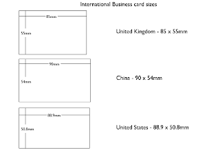
In doing this research I have found some contradicting information this website claims there is an international size of business card that is 85.60 x 53.98 mm (3.370 x 2.125 inches)


United Kingdom - 85mm x 55mm 
China                  - 90mm x 54mm
United States     - 88.9mm x 50.8mm 

I drew up a quick sketch on illustrator to show the size differences.
 I could not find much about how to give/ receive a business card in American culture, which made me think that it would be in a very similar way to how business cards are given out and received here in Britain. I did find this VIDEO that may be a slightly obsessive "How to Handle Your Business" video, but it is quite useful in the sense that it gives me an insight into how a typical American businessman would give and receive a companies business card .

This is quoted from the above website/ video
  
'What is the appropriate way to handle a business card?

The appropriate way to handle a business card is, let's say you're at a table with people, and someone around the table wants your card, you should not pass it between hands. You get up and you walk around the table, and give someone your business card. Gentlemen, if someone gives you their business card, don't take your wallet out of your back pocket, put it in your wallet, and then put it back in your pocket. In some cultures that's considered an obscene gesture, so avoid doing that. You should treat the business card like a thin piece of glass. For example, if you're handing someone your business card, hand it to them by the edge, with the print facing them, so when they get it they can read it. Don't hand the business card sideways and with two fingers as there's certain things you don't do and this is not appropriate. Hand it with one hand facing the person, and when you receive a business card you can receive it with one hand. Then if you'll point to that business card, look at the person and ask them one question about the business card, just one, as it will make them think you looked at it, and that you care. For example, you could say "Oh, I see you're on the 12th floor of that bank building, what direction do you face?" Or even, "Great logo, tell me what that means". You can also use "Oh, you're Vice President of that company." Any trigger is appropriate when dealing with business cards, and they'll talk and have a good time with you. But, if you just take the business card, which most people do, and put it away, what does that tell them? It tells them that you really don't care, that it's just a cursory waste of your time. It's always appropriate to comment on a business card, in fact, as long as you've got that finger on their card, they'll talk to you.'
 

Design Process - How to travel as a bussinesman- research

After we initially decided to focus the travel guide on the business countries around Europe, after a group discussion after the crit, we then decided it would be a good idea to limit the amount of countries we involved in the book, due to the amount of information that we would needed to gather and incorporate into each section of the book would be far to great for the limited time scale of the brief, so therefore decided that America and China would be the best countries to focus on, as they have the highest amount of business travel from Britain.

Fact's an figures from an American website of the typical business traveler.
Typical Business Traveler:
  • 16% are between 18-29 years old, while 10% are 60+ years old
  • 53% have professional, managerial, or technical roles compared to 28% being sales or service workers
  • 40% are women
  • $76,100: average annual salary
  • 5.4 trips per year
  • 3.3 nights: typical length of a business trip
  • 74% are less than 250 miles from point of departure
  • 81% of trips are by personal vehicle compared to 16% by plane
  • 102 miles, 816 miles: the median distance travel by car and plane
  • 47%: business trips were to attend a meeting, trade show or convention
  • 23%: fell asleep during a meeting

 click HERE to visit website

The above info graphic visually shows all the facts and figures from the above bullet points. They do this in a more comical cartoon illustrated way, which is not what we want to do, but the way they use graphs and charts, and the simplicity of the images will be something to take influence from.

Saturday 3 December 2011

Notes from Context of Practice lecture 4 Film theory 1.

What is an Auteur?
  • A filmmaker whos films are molded by a filmmaker's (Directors) creative influence.
  • Auteurs work is original
  • They have creative control
  • They use personal film language
  • They often create conventions of a genre but often do not follow them.
  • Auteur's are like artists, they are the creators of their own work, they are in control of whether they stick to the set rules they have individually created OR whether they break the rules they have set for themselves.
  • Andre Bazin, Jacques Doniol-Valcroze and Joseph-Marie Lo Duca, founded 'Cahiers du Cinema' (Notebook of cinema) in 1951, This film critics publication was heavily influenced by Hollywood at the time.
Hitchcock and why he was important 
  • In 1920 Hitchcok started his career in the film industry, he was drawing film sets as he was a skilled artist.
  • He continued his apprenticeship with Graham Cutts at Gainsborough
  • In 1925, Michael Balcon sent Hitchcok to Germany to work with F.W. Murnau's
  • Hitchocock was a pioneer, he used suspense using his revolutionary technical abilities, such as, Expressionist lighting, the Dolly zoom and his use of montage and cutting to create tension, he was revolutionary in the film industry.
The Lodger 1927

  • in 1927 Hitchcok created the Lodger, a silent film aimed to provoke as much fear and suspense to the audience as possible.
  • He did this by using lighting to convey emotions, as well as his use of different and fast moving shots, cuts and montage.
  • The visually dialogued film, so instead of using the characters vocal dialogue to create tension, he instead uses his pioneered techniques to convey the emotion of specific scenes, quick moving edited shots provoke this tension.
  • His signature was to include cameo appearances in his film, this was like his trademark, again similar to an artist. 
  • He often used blond haired actresses in him films ' Blondeds make the best victims. They're like virgin snow that shows up the bloody footprints.'
  • 'There's no terror in the bang of the gun, only the anticipation of it'

  • Hitchcock films are not concerned with realism or naturalism, he is only interested in evoking emotional responses from his audience. 
 Vertigo
  •  Expressionism through his use of colour and dolly zoom
  • Hitchcock was obsessed over the physiological thoughts of his audience
  • He uses techniques such as voyeurism and trauma.
  • "Always make the audience suffer as much as possible"
  • 1938 Hitchcock leaves Gainsborough studios to work in America where David O Selznick introduces his to pyschoanalyis.
  • Together they made 'Rebecca' (1940), 'Spellbound' (1945) and 'Notorious' (1946)
  • The Bird's-Eye view was also pioneered.
  • and the birds were the most prominent motif in sabotage and they appear in 'Young and Innocent' (1938), 'The Lady Vanishes' (1938), 'Jamaica Inn' (1939), 'Saboteur' (1942) and 'Psycho'


Thursday 1 December 2011

Design Process - How to travel as a businessman Research

I have decided to take a look at different info-graphics that have a relation to travel, to see what is possible and what has already been done.
I came across this blog called Coolinforgraphics.com, in this instance they are focusing on travel infographics, click HERE to visit website.
Inforgraphic from hotel.com showing the change in hotel prices around the world from 2010-2011.
This chart is still quite complex and is not immediately obvious of how it is conveying the information, but once you read and analyse the infographic it proves a pretty accurate way of providing the correct information and scales.


Infographic by Simpliflying showing the increase and prediction that the future of loyalty programs will be powered by social media.
I like this infographic, using commonly known symbols and logos that will either be seen either online or on airport signage, they clearly communicate in simple graphics the increase in frequent fliers using social networking sites to prove their loyalty to individual airlines.
You are able to easily take in the information given to you as you work down the ladder.


Above you will see another infographic from hotels.com explaining changes in US hotel usage by international and domestic customers, as well as different graphics explaining popular destinations in the US.
Simple infographics using chart like imagery to convey information, basic shapes have been used to portrait areas of importance which then can be worked out by the key provided, similar to the task we did with our previous how to.


This is an infographics by 5W infographics, this quite an impressive company, who bases their entire practice around infographics and aims to help businesses make their visual displays of information more simple, clear, engaging and legible.
The abe example is a infographic comparison of flight classes.


This is an infographic video showing the worlds air traffic over a 24 hour period, click HERE to watch movie


Infographic of How to survive e airport security, simple shapes, colours and instructions make the design easy to follow and understand, they us colours to highlight important areas and use generic shades of grey and white to provide crucial yet less important factors of the design.


This is actually quite an interesting little infographic video about a day of travelling in an airport, by Ian Anderson
Click HERE to view video 


Language of Europe infographics map, just using maps and colours and a key to simply convey the information they want to present.