
Felix von der Weppen
http://www.behance.net/felixvonderweppen


In the publication above, i really like the choice of stock as well as the actual format of the brochure.
I would like to use a similar type stock for the cover of my info pack, as i think it would work well with both embossing and foiling. it also has a lovely texture to it which makes it look kind of leathery.
James Kape
http://swisslegacy.com/page/5/


Looking more at the print process and finishing techniques used on this printed set. nice simplicity which highlights the individual area of foiling on the logo.
Richard Long
http://www.tate.org.uk/art/artworks/long-nile-papers-of-river-muds-ar00599

Uses different non uniformed stocks to create publication, proves the power of stock choice when thinking of print production, I like the fact that the stock creates 90% of the design, the designer has had to do very little really and has produced a really nice looking book.
Helen Friel
http://www.flavorwire.com/277657/10-crazy-and-unusual-book-designs#9

Again this design caught my eye due to the unique format of the publication, the fact that the reader must interact with the publication in some way in order to read it is a clever idea, i think this would be annoying in some cases (if someone just wants to read a book for example) the fact that they have to rip and manipulate pages in orer to do so may become a little tiring, but if a book is focused around aesthetics and concept then I think an idea similar to this could create a visually pleasing piece of design..
DayCraft
http://www.daycraft.com.hk/products/notebooks/signature-gutenberg.html
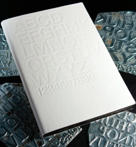
DayCraft have an interesting website that revolves around nicely produced sketch books, diaries, notepads and others, they have an interesting array of products but they all have had interesting printing and finishing techniques incorporated into the design, the 'Signature Gutenberg Notebook' that you can see above uses letter press to create a greate yet simple front cover, that requires no ink printing at all.
John Christie and Ron King
http://www.flavorwire.com/277657/10-crazy-and-unusual-book-designs#2

Bruketa&Žinić
http://vimeo.com/27290030

Again an interesting idea, the book itself in daylight is completely plain and white, but when lights are truned down the text and spine glow, which obviously isn't a technique I would use in the print process as i believe in this case it may be a bit complicated as well as the fact that it doesn't really relate to the topic my info pack will be on.
Design Criminals
http://vimeo.com/19672172

Not 100% sure what this book is made out of, but the face that the front cover is more of a wrapping to the book than a way of binding. it would cause a problem once you have finished with the book and want to store/ display it, but the concept and interesting outcome impress me.
No comments:
Post a Comment