1. This first example of graphic design in the public domain is by Bruketa & Zinic a group of around 70 graphic designers and advertisement specialists from Zagreb in Croatia.
This is a bus stop advertisement for the jeans store Je"s
The entire concept behind the advertisement was to make the audience feel like their bum was exposed, they did this by placing the text low to the ground and keeping it a small font size, ensuring the reader will have to have their bum exposed to read it. The text reads: In this moment your bum is completely exposed. If you were in a sexy pair of jeans, it would attract attention all the time!
This seems like a clever way to advertise, put the target audience in a situation where they cannot ignore the advertisement, it draws in attention as people wonder what it says, The advert plays off the fact the viewer must have their bum exposed to read the text, therefore it is true for everyone who reads it.
2. This is an advertisement for Canon by Deehong Communications from S.Korea
3. This is an Album promotion 3D poster for Dry the River's album Horses
The horses themselves were created by Xavier Barrade from FOAM Creative
From watching the video you can see the skill that went into this project, I think for a band this would be an incredible promotion, if you found these around your city you would definitely notice them and more than likely go and inspect the posters closer to find out what they actually advertise, therefore fantastic promotion for a band. A second point is, if you listen to the music of dry the river and appreciate the elegance and beauty of the music you can see these posters reflect the art, elegance and passion of the music.
4. This is an advertisement for Leica by Advico Y&R, from, Zurich, Switzerland
Another clever idea to advertise the quality of their equipment, humerus yet smart, it would certainly get attention from passers by and because of the comedy value it will most certainly stick in the minds of many of the people who saw it, resulting in good advertising techniques.
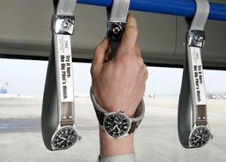
5. For my final selection I am choosing a number of outdoor advertisements that unfortunately I could not find the designers for.


No comments:
Post a Comment